31 August 2012

The Price is Right

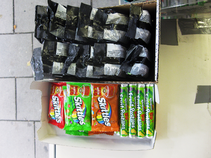
The label-maker has been acting up at one of the kiosks I visit.  It tends to over-ink, the roll of sticky labels jams, and the digits don't turn as they're supposed to.  The result has been a remarkable material diversity of price tags, even more varied by the number of people who use this machine -- some including additional zeros, others omitting the decimal or pound sign.


Due to this mechanical dysfunction, many of the newer prices have been handwritten, sometimes directly on the product box.  Still others were printed with the aid of a computer when the kiosk opened.  All of this results in an incredible array of price labels displayed across products and also layered on top each other, showing changes of prices and styles through time.  


For the most part, prices are posted for kiosk employees to limit confusion and fluctuations... an occasional challenge for cash businesses without UPC scanners.  Should the blotchy ink make labels undecipherable, prices are also presented behind the counter on a piece of weathered paper in neat capital letters.  

20 August 2012

Mind the Gap

I recently found the tumblr blog Things Organised Neatly.  Perhaps it’s a hint of OCD that makes me revel in this sort of order.  Using the “align” tool in Adobe programs – to snap multiple edges in position or distribute objects evenly across an art board – gives the same sense of thrilling satisfaction.  (Surely I’m not the only one who reorganises my spice shelf or wallet to unwind.)

Although the modern aesthetic most often celebrated on Things Organised Neatly may feel miles away from the tangle of ad hoc displays, parallels can be made and seen.


As noted a couple posts ago, there is logic to the organisation of things.  The logics described earlier were more pragmatic, but they guide aesthetic considerations too in the curation of ad hoc shops.

I'm told that above all, gaps should be avoided.  They make shelves look undersupplied and interrupt the smooth plane of goods.  If a product is out, another should always be moved to its place, brought flush to the shelf edge.


In the kiosk where I spend time, stock for products new and old is always coming in, requiring a daily shuffle to ensure spaces are filled.  This sometimes necessitates putting products in another brand's box, finding aptly sized products to fill specific gaps, combining several products in one container, or cutting display packages so they better slide in spaces available.  It feels like an immersive game of Tetris – known as the “brick game” in Bangladesh.


In most shops, colour is also a concern, as it differentiates products from each other.  Similar products with similar colours must always be separated by a contrasting colour.  Most importantly, like products should be grouped together – similar scarves together, gum with gum, like toothpastes in proper piles. 


On slow days in the kiosk, we play cards and watch the neighbourhood whirl around us.  When people walk by, they almost always look, but not at us necessarily.  As they pass, it seems their eyes skim across the array of shiny packages.  Their focuses don’t linger at any one point, and I doubt they’re really looking for anything.  Instead, I think the eye enjoys gliding over the flush plane of branded things.  Their neat organisation entices the eye and must improve patronage of the shop as well.


07 August 2012

Olympic Hurdles on the High Street

A few weeks ago, a colleague of mine forwarded a Daily Mail article detailing the makeover of “tatty” Leyton High Road in East London.  The revitalisation was done in anticipation of the Olympics and the arrival of the torch relay.  These images, from the article, illustrate the transformation:


I won’t elaborate on my reservations about imposing a conservative English village aesthetic on one of London’s most diverse neighbourhoods.  (There's a lot to unpack here!)  Instead, I’d like to focus on the relationships between grooming shopping parades, the presence of corporate brands, and the Olympic trademark.

What I find particularly interesting is how corporate branding is tempered through this revitalisation.  It seems advertising and branding contribute to the so-called “tattiness” of the street.  To spruce things up, the Council evidently clamped down on corporate displays.


The irony here is that with the LOCOG’s tight restrictions on using the Olympic trademark, the only way to show support for the Games is to display the branded material of an official corporate sponsor.  Displays of rings, signage, or even mentions of “London 2012”, are forbidden.  Cadbury and Coca-Cola offer shopkeepers more than enough material to show their Olympic spirit... and sell their products.  Many ad hoc shops in my neighbourhood are using such material, and endorsing official products, to “get behind the games” and stimulate essential sales. 


And, of course, the Union Jack always adds a celebratory feel... its own kind of brand.