After a trip, a move, and a short ailment, I’m back wandering the streets of Camden. At times, I’ve been doing so in the company of representatives from corner shop brands.
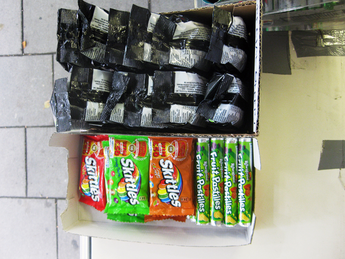
Each ad hoc display is an assemblage of material brought together by different actors, and branding reps play an important part in this curation. As well as information about current promotions, these reps provide shops with a bounty of branded materials, including carrier bags, canopies, posters, stickers, sign boards, Ramadan schedules, Oyster card holders, window displays, leaflets, and pads of sticky notes. While some of this material is used at the discretion of shopkeepers, materials are most often put up by the reps themselves. The reps also advise shopkeepers on styles of display and, when allowed, reorganise products. They may, for example, move their products to the front and centre of a display or assemble like products so direct comparisons can be made by consumers.

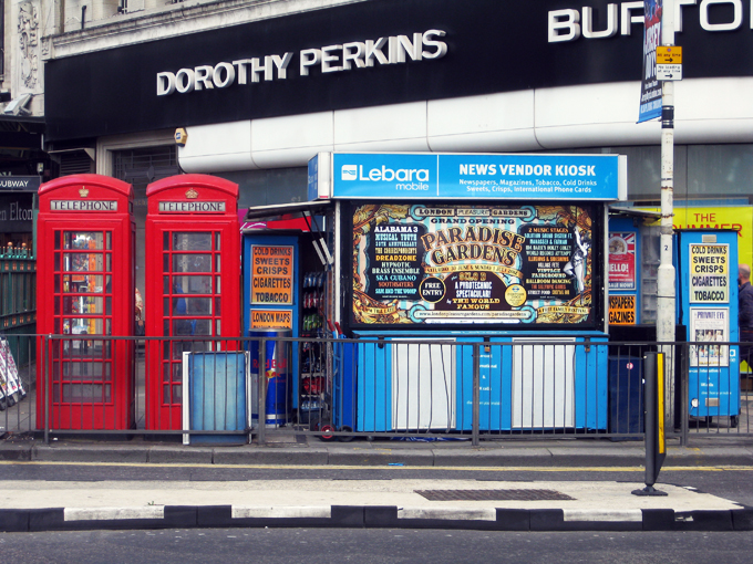
As discussed in earlier posts, brands become markers for ad hoc shops and help announce shops’ presence in space. The identities of brand and shop are intertwined, especially in kiosks, which seldom display a business name. To discuss these connections with a brand representative, I suggested how the Wall’s sign acts like the barber pole of the corner shop. To further my analogy, he told me his posters are like the hairstyle photos inside the barber shop – they tell customers what’s on offer and educate on the latest styles.
Competition is fierce for surface area and – with shop keepers’ permission – reps will cover the promotional materials of others. Although reps remove outdated posters, layers of material are evident on all surfaces. Constant visits to these shops ensure that materials are current, unobscured, and in good shape.
Material properties of the promotional stuff and the shops themselves pose challenges to the reps. In one shop, packing tape doesn't adhere well to a new "silent" plastic newspaper box. In another, a stairwell in front of a shop window makes applying stickers a challenge for Lyca reps, whose stickers are sticky only on the back. Unlike Oyster stickers with double-sided adhesive, they cannot be applied from the inside. Each new addition is documented with photographic evidence and submitted to the brands’ head office.
Some reps explain that shop keepers are fortunate to don their brand. They believe the benefits of brand association are payment enough. Others offer shop keepers product vouchers or cash to display their promotional materials. In either case, many brand representatives strike exclusive deals with shop keepers, to limit the presence of other branding on the shop front. In businesses with such small margins, these deals are hugely advantageous. Interactions between brands and shop keepers are not without dispute. Negotiations for exclusivity are on-going and some shop keepers shared their frustration after waiting months for canopies promised after reps reorganised their displays. Many are still waiting.
Each ad hoc display is an assemblage of material brought together by different actors, and branding reps play an important part in this curation. As well as information about current promotions, these reps provide shops with a bounty of branded materials, including carrier bags, canopies, posters, stickers, sign boards, Ramadan schedules, Oyster card holders, window displays, leaflets, and pads of sticky notes. While some of this material is used at the discretion of shopkeepers, materials are most often put up by the reps themselves. The reps also advise shopkeepers on styles of display and, when allowed, reorganise products. They may, for example, move their products to the front and centre of a display or assemble like products so direct comparisons can be made by consumers.

As discussed in earlier posts, brands become markers for ad hoc shops and help announce shops’ presence in space. The identities of brand and shop are intertwined, especially in kiosks, which seldom display a business name. To discuss these connections with a brand representative, I suggested how the Wall’s sign acts like the barber pole of the corner shop. To further my analogy, he told me his posters are like the hairstyle photos inside the barber shop – they tell customers what’s on offer and educate on the latest styles.
Competition is fierce for surface area and – with shop keepers’ permission – reps will cover the promotional materials of others. Although reps remove outdated posters, layers of material are evident on all surfaces. Constant visits to these shops ensure that materials are current, unobscured, and in good shape.
Material properties of the promotional stuff and the shops themselves pose challenges to the reps. In one shop, packing tape doesn't adhere well to a new "silent" plastic newspaper box. In another, a stairwell in front of a shop window makes applying stickers a challenge for Lyca reps, whose stickers are sticky only on the back. Unlike Oyster stickers with double-sided adhesive, they cannot be applied from the inside. Each new addition is documented with photographic evidence and submitted to the brands’ head office.
Some reps explain that shop keepers are fortunate to don their brand. They believe the benefits of brand association are payment enough. Others offer shop keepers product vouchers or cash to display their promotional materials. In either case, many brand representatives strike exclusive deals with shop keepers, to limit the presence of other branding on the shop front. In businesses with such small margins, these deals are hugely advantageous. Interactions between brands and shop keepers are not without dispute. Negotiations for exclusivity are on-going and some shop keepers shared their frustration after waiting months for canopies promised after reps reorganised their displays. Many are still waiting.


