18 April 2012

Turkish delight

I just returned from a trip to Istanbul. It was not a research expedition, but the care and precision of products displayed in markets and shops was noteworthy. In most fruit stands, for example, apples all sat with their stems upwards and in the Spice Bazaar treats were piled in perfect pyramids.


Upon my return, I noticed how much the image below, taken in Beyoğlu, resembles one I took last summer in London.


This was taken on Deptford High Street last July:


The images, things, and organisation are extraordinarily similar. This speaks, perhaps, to the transnational flow of certain types of (injection-mould, plastic) objects and to how curatorial logics are shared across borders.

There were other familiar landmarks as well. In Turkey, this one goes by the name "Algida"!


29 March 2012

Gridiron Plan

Although the organisation of things in some ad hoc shops may seem chaotic, many product arrays are tightly structured according to a grid-like plan.


To see how this apparent grid relates to both the objects on display and the structuring elements -- like shelves, racks, boards, counters, fridges, etc. -- I crudely traced the outlines of both for the above kiosk.


Juxtaposing both outlines shows, of course, how the grids of the kiosk structure influence the orthogonal organisation of goods on display.


The juxtaposition also shows how, even in the absence of structuring elements, objects themselves are grouped according to type and size contributing to a sense of regularity and rhythm.

04 March 2012

Through a hole, darkly

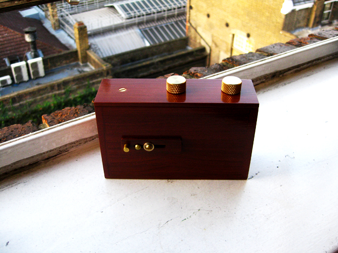
I have been experimenting recently with my pinhole camera.  It's a very simple device; it has no viewfinder, batteries, or play-back function, and uses medium-format film.


Because of the rudimentary nature of camera – and because the shutter must be manually opened for a number of seconds – the resulting images are blurry and atmospheric and warp in delightful ways.


This sort of photographic practice chimes with my project in a number of respects.  To start, because the shutter is open for so long, the images better capture the animation of things and spaces.  It captures movement – the unsteadiness of my hand, the flow of the city, and the vibrations of stationary things.


Equally as exciting to me, the camera itself feels like a thing as opposed to a technology.  In this, way, the camera remains a thing among things through the photographic process.


Because I don’t need to hold it to my face, the pin-hole camera doesn’t mediate my experience of the space.  My presence in the scene remains uninterrupted.  The camera, the other things in the shop, the shopkeeper, and I can all actively be in the space as its light and colour are captured on film.


The camera has become a welcomed talking point with shopkeepers.  Whereas the D-SLR can feel techy and conspicuous, the pin-hole is charming and unobtrusive. 


Although photography need not be about taking, street photography is often associated with masculinity, aggression, and a patriarchal way of seeing.   Certainly participation and openness can be felt in digital street photography as well.  Still, it feels like the pin-hole camera tends towards greater sharing, participation, and parity.


I am really taken by the softness of the images in contrast to the characteristic plasticity or shininess of the brands.  The pin-hole camera literally takes the edge off and references the tenderness of the curation. It seems to challenge the linearity and brandedness of the things in these places.  By capturing pattern and colour, the pin-hole melts these brands into the texture of the city.

01 March 2012

Border state

When I moved to London in autumn 2010, corner shops had bright blue adhesive borders around their windows to advertise the TFL Oyster top-ups available inside. Six months later or so, I noticed Lebara phone card branding had begun occupying this space. The vibrant azure blue is virtually the same in both brands.


Outside of my study area, but along an often travelled route, shop keepers on Edgware Road combine the Oyster and Lebara borders.  It is a very clever – and virtually seamless – merging of branded material. (Very exciting!)

 
In the last few months it seems Lebara has been upstaged by Lyca, another phone company, which has been increasingly occupying this edge space.  Their blue is more cobalt in hue. 


Recently Oyster stepped up and designed a flashier border, which uses the azure and cobalt blues on the Oyster logo card.  The cobalt matching the Lyca logo quite well.  


Like the shop on Edgware Road, the shops in Bloomsbury/King's Cross area show some amazing mash-ups of this material.  In the image below, Oyster, Lyca, and Lebara collide.

Wall's has also become part of the shop window borderlands.

24 February 2012

Writing's on the Wall's

At Goldsmiths’ urban photography summer school last July, I became fixated on the Wall’s ice cream sign that corner shops place on the pavement. Like the barber pole, these signs act as landmarks, announcing not only the treats inside, but also the shops in urban space.


The signs also illuminate the everyday practice of shopkeepers and highlight how mass-produced things acquire individual character through placement and use.


More recently, I have been thinking about the relationship between materiality of corner shops and the fabric of the city. The Wall’s ice cream sign can be seen as an urban London icon. Is it coincidence that the Wall’s sign shares colour and form with the other more celebrated London icons?