I recently found the tumblr blog Things Organised Neatly. Perhaps it’s a hint of OCD that makes me revel in this sort of order. Using the “align” tool in Adobe programs – to snap multiple edges in position or distribute objects evenly across an art board – gives the same sense of thrilling satisfaction. (Surely I’m not the only one who reorganises my spice shelf or wallet to unwind.)
Although the modern aesthetic most often celebrated on Things Organised Neatly may feel miles away from the tangle of ad hoc displays, parallels can be made and seen.
As noted a couple posts ago, there is logic to the organisation of things. The logics described earlier were more pragmatic, but they guide aesthetic considerations too in the curation of ad hoc shops.
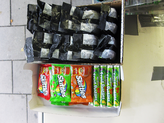
I'm told that above all, gaps should be avoided. They make shelves look undersupplied and interrupt the smooth plane of goods. If a product is out, another should always be moved to its place, brought flush to the shelf edge.
In the kiosk where I spend time, stock for products new and old is always coming in, requiring a daily shuffle to ensure spaces are filled. This sometimes necessitates putting products in another brand's box, finding aptly sized products to fill specific gaps, combining several products in one container, or cutting display packages so they better slide in spaces available. It feels like an immersive game of Tetris – known as the “brick game” in Bangladesh.
In most shops, colour is also a concern, as it differentiates products from each other. Similar products with similar colours must always be separated by a contrasting colour. Most importantly, like products should be grouped together – similar scarves together, gum with gum, like toothpastes in proper piles.
On slow days in the kiosk, we play cards and watch the neighbourhood whirl around us. When people walk by, they almost always look, but not at us necessarily. As they pass, it seems their eyes skim across the array of shiny packages. Their focuses don’t linger at any one point, and I doubt they’re really looking for anything. Instead, I think the eye enjoys gliding over the flush plane of branded things. Their neat organisation entices the eye and must improve patronage of the shop as well.
Although the modern aesthetic most often celebrated on Things Organised Neatly may feel miles away from the tangle of ad hoc displays, parallels can be made and seen.
As noted a couple posts ago, there is logic to the organisation of things. The logics described earlier were more pragmatic, but they guide aesthetic considerations too in the curation of ad hoc shops.
I'm told that above all, gaps should be avoided. They make shelves look undersupplied and interrupt the smooth plane of goods. If a product is out, another should always be moved to its place, brought flush to the shelf edge.
In the kiosk where I spend time, stock for products new and old is always coming in, requiring a daily shuffle to ensure spaces are filled. This sometimes necessitates putting products in another brand's box, finding aptly sized products to fill specific gaps, combining several products in one container, or cutting display packages so they better slide in spaces available. It feels like an immersive game of Tetris – known as the “brick game” in Bangladesh.


No comments:
Post a Comment