Showing posts with label corner shops. Show all posts

24 October 2012

Brandscape Architects

After a trip, a move, and a short ailment, I’m back wandering the streets of Camden.  At times, I’ve been doing so in the company of representatives from corner shop brands. 


Each ad hoc display is an assemblage of material brought together by different actors, and branding reps play an important part in this curation.  As well as information about current promotions, these reps provide shops with a bounty of branded materials, including carrier bags, canopies, posters, stickers, sign boards, Ramadan schedules, Oyster card holders, window displays, leaflets, and pads of sticky notes.  While some of this material is used at the discretion of shopkeepers, materials are most often put up by the reps themselves.  The reps also advise shopkeepers on styles of display and, when allowed, reorganise products.  They may, for example, move their products to the front and centre of a display or assemble like products so direct comparisons can be made by consumers.


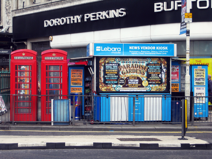
As discussed in earlier posts, brands become markers for ad hoc shops and help announce shops’ presence in space.  The identities of brand and shop are intertwined, especially in kiosks, which seldom display a business name.  To discuss these connections with a brand representative, I suggested how the Wall’s sign acts like the barber pole of the corner shop.  To further my analogy, he told me his posters are like the hairstyle photos inside the barber shop – they tell customers what’s on offer and educate on the latest styles.  


Competition is fierce for surface area and – with shop keepers’ permission – reps will cover the promotional materials of others.  Although reps remove outdated posters, layers of material are evident on all surfaces.  Constant visits to these shops ensure that materials are current, unobscured, and in good shape.

Material properties of the promotional stuff and the shops themselves pose challenges to the reps.  In one shop, packing tape doesn't adhere well to a new "silent" plastic newspaper box.  In another, a stairwell in front of a shop window makes applying stickers a challenge for Lyca reps, whose stickers are sticky only on the back.  Unlike Oyster stickers with double-sided adhesive, they cannot be applied from the inside.  Each new addition is documented with photographic evidence and submitted to the brands’ head office. 


Some reps explain that shop keepers are fortunate to don their brand.  They believe the benefits of brand association are payment enough.  Others offer shop keepers product vouchers or cash to display their promotional materials.  In either case, many brand representatives strike exclusive deals with shop keepers, to limit the presence of other branding on the shop front.  In businesses with such small margins, these deals are hugely advantageous.  Interactions between brands and shop keepers are not without dispute.  Negotiations for exclusivity are on-going and some shop keepers shared their frustration after waiting months for canopies promised after reps reorganised their displays.  Many are still waiting. 


20 August 2012

Mind the Gap

I recently found the tumblr blog Things Organised Neatly.  Perhaps it’s a hint of OCD that makes me revel in this sort of order.  Using the “align” tool in Adobe programs – to snap multiple edges in position or distribute objects evenly across an art board – gives the same sense of thrilling satisfaction.  (Surely I’m not the only one who reorganises my spice shelf or wallet to unwind.)

Although the modern aesthetic most often celebrated on Things Organised Neatly may feel miles away from the tangle of ad hoc displays, parallels can be made and seen.


As noted a couple posts ago, there is logic to the organisation of things.  The logics described earlier were more pragmatic, but they guide aesthetic considerations too in the curation of ad hoc shops.

I'm told that above all, gaps should be avoided.  They make shelves look undersupplied and interrupt the smooth plane of goods.  If a product is out, another should always be moved to its place, brought flush to the shelf edge.


In the kiosk where I spend time, stock for products new and old is always coming in, requiring a daily shuffle to ensure spaces are filled.  This sometimes necessitates putting products in another brand's box, finding aptly sized products to fill specific gaps, combining several products in one container, or cutting display packages so they better slide in spaces available.  It feels like an immersive game of Tetris – known as the “brick game” in Bangladesh.


In most shops, colour is also a concern, as it differentiates products from each other.  Similar products with similar colours must always be separated by a contrasting colour.  Most importantly, like products should be grouped together – similar scarves together, gum with gum, like toothpastes in proper piles. 


On slow days in the kiosk, we play cards and watch the neighbourhood whirl around us.  When people walk by, they almost always look, but not at us necessarily.  As they pass, it seems their eyes skim across the array of shiny packages.  Their focuses don’t linger at any one point, and I doubt they’re really looking for anything.  Instead, I think the eye enjoys gliding over the flush plane of branded things.  Their neat organisation entices the eye and must improve patronage of the shop as well.


07 August 2012

Olympic Hurdles on the High Street

A few weeks ago, a colleague of mine forwarded a Daily Mail article detailing the makeover of “tatty” Leyton High Road in East London.  The revitalisation was done in anticipation of the Olympics and the arrival of the torch relay.  These images, from the article, illustrate the transformation:


I won’t elaborate on my reservations about imposing a conservative English village aesthetic on one of London’s most diverse neighbourhoods.  (There's a lot to unpack here!)  Instead, I’d like to focus on the relationships between grooming shopping parades, the presence of corporate brands, and the Olympic trademark.

What I find particularly interesting is how corporate branding is tempered through this revitalisation.  It seems advertising and branding contribute to the so-called “tattiness” of the street.  To spruce things up, the Council evidently clamped down on corporate displays.


The irony here is that with the LOCOG’s tight restrictions on using the Olympic trademark, the only way to show support for the Games is to display the branded material of an official corporate sponsor.  Displays of rings, signage, or even mentions of “London 2012”, are forbidden.  Cadbury and Coca-Cola offer shopkeepers more than enough material to show their Olympic spirit... and sell their products.  Many ad hoc shops in my neighbourhood are using such material, and endorsing official products, to “get behind the games” and stimulate essential sales. 


And, of course, the Union Jack always adds a celebratory feel... its own kind of brand.


23 July 2012

News and Weather

This summer has seen some of the wettest conditions on record.  Recent reports from high street chains describe disappointing sales.  Most ad hoc shopkeepers also bemoan the rotten conditions.  Wet days change our regular routines: we dart to the Tube station after work instead of sipping a cold drink in the park; we forego the ice cream sandwich on the street in favour of a hot drink in a cafe; we spend less, hibernate more.  This all hurts convenience retailers, souvenir shops, kiosks, and newsagents. 


There’s no way to the ward off the rains, but material adaptations mitigate its effects. 


For kiosks, the canopy is particularly essential.  Shopkeepers discuss how patrons take refuge beneath it during the rain and how they’re more likely to stop for a purchase on wet days if it means a short time under cover.  Without a canopy, many have to close when the rains come so products don’t get soaked. 

I’ve spoken to a number of shopkeepers with broken canopies, waiting for corporate producers to deliver promised branded covers.  Many have been waiting a long time and others have thrown up their hands and shelled out themselves, knowing these delays cost their business.


Albeit a bane to most, a few retailers in my neighbourhood have sheepishly delighted in this soggy season – namely those selling umbrellas.  Some of these vendors – with licences to sell “weather goods”: sunglasses, umbrellas, scarves, gloves, pashminas, etc. – report record sales.  Although it’s rained almost every day in the last few months, it seems people are still often caught out sans brolly.


15 July 2012

Press Gallery

I’m told selling magazines and newspapers is a tough business.  Shopkeepers pay for delivery of the material and margins are low.  This is compounded by print media sales being down overall, owing to so much online information and so many free papers.  Shop-front promotion of print materials helps to some extent.  By occupying a significant portion of the frontage, it also contributes to the texture of shops in the neighbourhood.


Newspapers and magazines are promoted in purpose-built frames – affixed to windows, paper boxes, and exterior walls – and on wooden news boards, which hold headlines behind wire mounts.  Generally, the former are designed for blown-up magazine covers, and the latter for newspaper headlines... but rules are made to be broken.


Newspaper headline posters may be sent to shops through the post and positioned by the shopkeepers themselves, whereas the magazine posters are often placed directly by magazine reps who tend to organise them in multiples for higher impact.


Of course, mobile companies like Lebara and Lyca produce posters that also slip into these frames and have created stickers to capture this space.  Shopkeepers use them for their own unbranded promotions too, and tend to use text instead of image. 


News boards are an enduring part of the high street.  Here, an image taken in 1903, on (a now demolished block of) Marchmont Street, shows an array of headlines... not to mention a good deal of chocolate branding in the adjacent windows.  Everything old is new again.


11 July 2012

Birds of a Feather Flock Together

There are almost 80 ad hoc shops in my study area.  Delineating the area took some consideration -- walking, mapping, counting, reflecting -- but when the dust settled, I found myself looking at an area that behaved very like my neighbourhood when I lived in WC1N.  I lived on Mecklenburgh Square through my first year in London and will return there in September.  Although my flat was towards the eastern edge, daily life pulled me westward, where ad hoc shops are woven around cultural landmarks, educational institutions, and other wide-ranging commercial offerings.

It strikes me how clustered these shops are and how they stick to the thoroughfares -- Tottenham Court Road, Southampton Row, and Gray's Inn Road.  Economies of agglomeration?  I don't think that's it.  The reasons are surely complicated, relating to history, built form, zoning, and shifts in neighbourhood composition.  And I also think they go with the flow; the current locations relate to pedestrian traffic around transit nodes, main streets, and institutions.  The British Museum is obviously a major anchor for ad hoc action and fruit stall vendors told me they would never consider locating away from a Tube entrance.

Although it may seem unsound for corner shops to locate so close together -- take the four at the northern corner of my site, for example -- it seems each specialises as a result.  Some sell lotto tickets; some trade in magazines; some provide produce; some stock newspapers.  Others don't.  Apparently corner shops in the area defy popular convention in at least two ways.  One, they aren't all distributed equally through the urban area to supply residents with daily essentials.  And two, they are seldom found on corners. 

24 June 2012

Fruits of Labour

When fruit and vegetables are sold in ad hoc shops, they are most often found in the forecourt -- the space out front between the threshold and the property line.  In my neighbourhood, fruit is also sold at a number of kiosks located on the pavement by entrances to the Tube.  While not entirely ubiquitous, most shopkeepers incorporate astro turf in these displays.


Including sheets of artificial grass with fruit is tradition, I was told again and again.  It makes the fruit pop and helps craft a more natural display.  The green is eye-catching; it looks nice.  I was also told that 20 years ago, shopkeeping fashion dictated that fruit was displayed in bushel boxes.  These boxes made fruit look just carried from the fields, whereas the turf makes it look just picked. 


Although they couldn't bear a bushel, cardboard fruit boxes are often used on the grassy green surfaces to order the fruit and veg.  Another very popular strategy is the use of clear plastic mixing bowls.  Stacked and grouped with colours aligned in horizonal or vertical bands the containing fruit is often sold by the bowlful and at a discount.  "Any bowl, one pound!"  Sometimes more.


Display strategies are not merely aesthetic.  The bowls help sell fruit at a volume and create a logic for display.  Still, some vendors oppose the mixing bowls and understand that the fruit sold therein is bought from other vendors very near, or past, its expiration.  As such, some believe consumers may associate the fruit with poor quality.  I have had excellent bananas from bowls and from boxes; I reserve my judgement.  Though I must say, if you're planning guacamole, a mixing bowl of avocados may be the best bet. 

As well as softening the display and providing a contrasting colour to the fruit, astro turf also behaves like a soft curtain, hiding boxes, fruit, and crates below.

While it's easy to dismiss turf as "fake" grass, it has unexpectedly sensual qualities.  The ribbons of plastic are surprisingly soft to the touch and feel kind of, well, grassy.  It's hard not to touch them when perusing the produce.  The way the light and wind hit the sheets of turf, and "blades" of grass, also reveals wonderfully rich tones of green.  It can end up seeming quite luxurious. 


The astro turf also shows time and practice.  It wears along creases and in lines, exposing the black weave behind and eventually creating pin-striped skirts for display tables.


At a meeting of urban natures, juxtaposition shows that perhaps the turf is more CMYK pigment green than grass green.  The grass is always greener...?