Showing posts with label colour. Show all posts

20 August 2012

Mind the Gap

I recently found the tumblr blog Things Organised Neatly.  Perhaps it’s a hint of OCD that makes me revel in this sort of order.  Using the “align” tool in Adobe programs – to snap multiple edges in position or distribute objects evenly across an art board – gives the same sense of thrilling satisfaction.  (Surely I’m not the only one who reorganises my spice shelf or wallet to unwind.)

Although the modern aesthetic most often celebrated on Things Organised Neatly may feel miles away from the tangle of ad hoc displays, parallels can be made and seen.


As noted a couple posts ago, there is logic to the organisation of things.  The logics described earlier were more pragmatic, but they guide aesthetic considerations too in the curation of ad hoc shops.

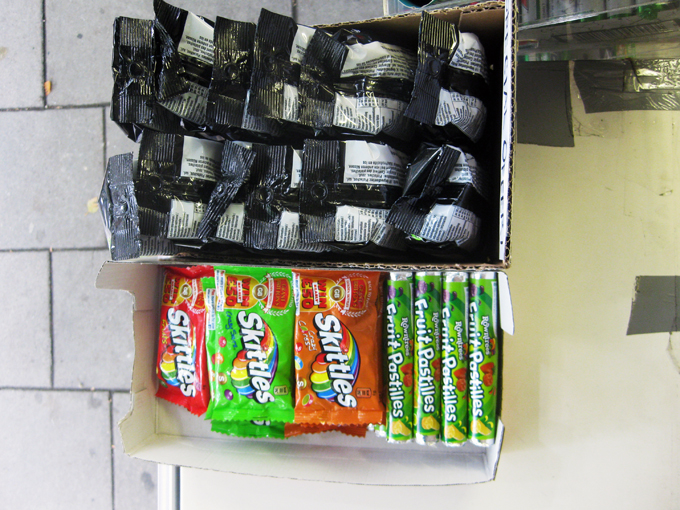
I'm told that above all, gaps should be avoided.  They make shelves look undersupplied and interrupt the smooth plane of goods.  If a product is out, another should always be moved to its place, brought flush to the shelf edge.


In the kiosk where I spend time, stock for products new and old is always coming in, requiring a daily shuffle to ensure spaces are filled.  This sometimes necessitates putting products in another brand's box, finding aptly sized products to fill specific gaps, combining several products in one container, or cutting display packages so they better slide in spaces available.  It feels like an immersive game of Tetris – known as the “brick game” in Bangladesh.


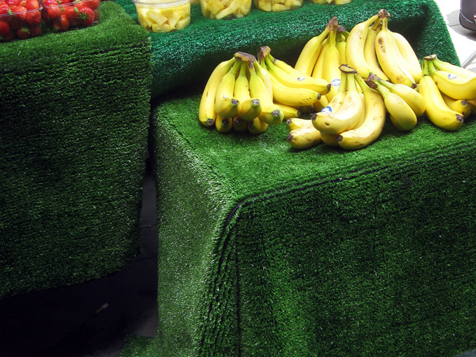
In most shops, colour is also a concern, as it differentiates products from each other.  Similar products with similar colours must always be separated by a contrasting colour.  Most importantly, like products should be grouped together – similar scarves together, gum with gum, like toothpastes in proper piles. 


On slow days in the kiosk, we play cards and watch the neighbourhood whirl around us.  When people walk by, they almost always look, but not at us necessarily.  As they pass, it seems their eyes skim across the array of shiny packages.  Their focuses don’t linger at any one point, and I doubt they’re really looking for anything.  Instead, I think the eye enjoys gliding over the flush plane of branded things.  Their neat organisation entices the eye and must improve patronage of the shop as well.


07 August 2012

Olympic Hurdles on the High Street

A few weeks ago, a colleague of mine forwarded a Daily Mail article detailing the makeover of “tatty” Leyton High Road in East London.  The revitalisation was done in anticipation of the Olympics and the arrival of the torch relay.  These images, from the article, illustrate the transformation:


I won’t elaborate on my reservations about imposing a conservative English village aesthetic on one of London’s most diverse neighbourhoods.  (There's a lot to unpack here!)  Instead, I’d like to focus on the relationships between grooming shopping parades, the presence of corporate brands, and the Olympic trademark.

What I find particularly interesting is how corporate branding is tempered through this revitalisation.  It seems advertising and branding contribute to the so-called “tattiness” of the street.  To spruce things up, the Council evidently clamped down on corporate displays.


The irony here is that with the LOCOG’s tight restrictions on using the Olympic trademark, the only way to show support for the Games is to display the branded material of an official corporate sponsor.  Displays of rings, signage, or even mentions of “London 2012”, are forbidden.  Cadbury and Coca-Cola offer shopkeepers more than enough material to show their Olympic spirit... and sell their products.  Many ad hoc shops in my neighbourhood are using such material, and endorsing official products, to “get behind the games” and stimulate essential sales. 


And, of course, the Union Jack always adds a celebratory feel... its own kind of brand.


24 June 2012

Fruits of Labour

When fruit and vegetables are sold in ad hoc shops, they are most often found in the forecourt -- the space out front between the threshold and the property line.  In my neighbourhood, fruit is also sold at a number of kiosks located on the pavement by entrances to the Tube.  While not entirely ubiquitous, most shopkeepers incorporate astro turf in these displays.


Including sheets of artificial grass with fruit is tradition, I was told again and again.  It makes the fruit pop and helps craft a more natural display.  The green is eye-catching; it looks nice.  I was also told that 20 years ago, shopkeeping fashion dictated that fruit was displayed in bushel boxes.  These boxes made fruit look just carried from the fields, whereas the turf makes it look just picked. 


Although they couldn't bear a bushel, cardboard fruit boxes are often used on the grassy green surfaces to order the fruit and veg.  Another very popular strategy is the use of clear plastic mixing bowls.  Stacked and grouped with colours aligned in horizonal or vertical bands the containing fruit is often sold by the bowlful and at a discount.  "Any bowl, one pound!"  Sometimes more.


Display strategies are not merely aesthetic.  The bowls help sell fruit at a volume and create a logic for display.  Still, some vendors oppose the mixing bowls and understand that the fruit sold therein is bought from other vendors very near, or past, its expiration.  As such, some believe consumers may associate the fruit with poor quality.  I have had excellent bananas from bowls and from boxes; I reserve my judgement.  Though I must say, if you're planning guacamole, a mixing bowl of avocados may be the best bet. 

As well as softening the display and providing a contrasting colour to the fruit, astro turf also behaves like a soft curtain, hiding boxes, fruit, and crates below.

While it's easy to dismiss turf as "fake" grass, it has unexpectedly sensual qualities.  The ribbons of plastic are surprisingly soft to the touch and feel kind of, well, grassy.  It's hard not to touch them when perusing the produce.  The way the light and wind hit the sheets of turf, and "blades" of grass, also reveals wonderfully rich tones of green.  It can end up seeming quite luxurious. 


The astro turf also shows time and practice.  It wears along creases and in lines, exposing the black weave behind and eventually creating pin-striped skirts for display tables.


At a meeting of urban natures, juxtaposition shows that perhaps the turf is more CMYK pigment green than grass green.  The grass is always greener...?


21 May 2012

OpenType

To locate material threads through the neighbourhood, I've been making typologies, meant to highlight not sameness, but difference.  The rectangular "Food & Wine" signs below all jut out from shop fronts at a right angle. They are all made on acrylic panels and encased in metal.  Many glow from the inside.  They announce the shop and its unique identity through font, kerning, leading, and colour. 


These "Off Licence" shops sell wine, of course, and often sell food as well.  (A rose by any other name...?)  It's interesting as well that, although many are not open 24 hours, some still read: Off Licence Open.


These open signs aren't all from corner shops, but are also part of the neighbourhood's signage landscape.  Each is composed of coloured flashing LED lights and most share the same no-nonsense all-caps sans-serif font.  Still, each is different from the next.


01 March 2012

Border state

When I moved to London in autumn 2010, corner shops had bright blue adhesive borders around their windows to advertise the TFL Oyster top-ups available inside. Six months later or so, I noticed Lebara phone card branding had begun occupying this space. The vibrant azure blue is virtually the same in both brands.


Outside of my study area, but along an often travelled route, shop keepers on Edgware Road combine the Oyster and Lebara borders.  It is a very clever – and virtually seamless – merging of branded material. (Very exciting!)

 
In the last few months it seems Lebara has been upstaged by Lyca, another phone company, which has been increasingly occupying this edge space.  Their blue is more cobalt in hue. 


Recently Oyster stepped up and designed a flashier border, which uses the azure and cobalt blues on the Oyster logo card.  The cobalt matching the Lyca logo quite well.  


Like the shop on Edgware Road, the shops in Bloomsbury/King's Cross area show some amazing mash-ups of this material.  In the image below, Oyster, Lyca, and Lebara collide.

Wall's has also become part of the shop window borderlands.

24 February 2012

Writing's on the Wall's

At Goldsmiths’ urban photography summer school last July, I became fixated on the Wall’s ice cream sign that corner shops place on the pavement. Like the barber pole, these signs act as landmarks, announcing not only the treats inside, but also the shops in urban space.


The signs also illuminate the everyday practice of shopkeepers and highlight how mass-produced things acquire individual character through placement and use.


More recently, I have been thinking about the relationship between materiality of corner shops and the fabric of the city. The Wall’s ice cream sign can be seen as an urban London icon. Is it coincidence that the Wall’s sign shares colour and form with the other more celebrated London icons?