11 June 2012

Displays of Jubilation

Over the last month, one object was particularly visible at those ad hoc shops selling souvenirs.

The Union Jack flag featuring a cameo of the Queen (sporting a sunny yellow ensemble) was seen all over London through the Jubilee celebrations… second only, perhaps, to the visibility of unadulterated Union Jacks.  The way it was flown at shops and kiosks often made it seem more like a shop-front adornment than a product for sale.  In this way, the shops stood as expressions of neighbourhood celebration.  The flag also became part of an elaborate stage for the display of other things.


Another Jubilee object was particularly prominent along Tottenham Court Road.  At the three kiosks selling handbags, luggage, and souvenirs, paper Elizabeth II masks were affixed to the retractable handles of rolling suitcases.  I love how the masks seem to come alive through the angles of their placement – the little tilts of the head and position of the elastic – and how the suitcases themselves become regal – but comically dumpy – bodies for the heads above.


Although I thought these clever displays may be emulating each other, it seems these three kiosks share the same managers.  This presents an interesting set of questions about local practice, curation, and ad hoc-ness; in any case, their displays do make me smile.


08 June 2012

Revived and Repurposed

Tottenham Court Road wasn't originally included in my study area, but I shuffled my boundary westwards to capture its kiosks.  Between Euston Road and Oxford Street, eleven kiosks offer a bounty of products and services, including: flowers, shoe shines, newspapers and magazines, convenience foods, fruit, souvenirs, and suitcases.


While I don't like to pick favourites, I do particularly like the repurposing of "Central Perks'".


This kiosk was once a sandwich and coffee shop -- as seen on flickr -- but has since been revived as a mobile phone unlocking and repair centre.


The shop keepers seem quite proud of their transfiguration and were delighted to have the kiosk photographed.  The name of the shop takes on a whole new meaning as a mobile repair shop -- speaking less to sitcoms and coffee, perhaps, and more to the convenience and advantages of having ad hoc shops and services in central London.  The refrigerated deli display case has accommodated a completely different function too, as the site of an array of dazzling iPhone covers.


01 June 2012

Stack in the Box

In front of corner shops, the space between the thresholds and the property line is often furnished with a number of things.  These may include various types of fruit displays, Wall’s signs, lotto displays and signage, newspaper racks, flowers, sandwich boards, and postcard racks, among others. 


While most of these things are moved inside at night, at many corner shops, news agents and kiosks, one large box remains outside.


In my neighbourhood, phone card advertisements are often affixed to these boxes.  Alternatively, they are fashioned with metal and plastic frames used to display current magazine covers.  In either case, they show the layering of stickers, paint, practice, wear and tear.


Their mystery was solved at the news agent on Euston Road.  The keeper explained that his large blue metal box is used for early morning newspaper deliveries and as a place to deposit old papers and magazines. 


Then he let me see inside.


25 May 2012

Event Horizon

Most things in corner shops have a strong horizontal orientation.  In earlier drawings I did of a kiosk, it was obvious that this largely relates to the design of shelving units.  Candy bar displays are no exception -- shiny arrays of sweets are stacked in linear projections.  The design of the product packages, and the orientation of their logos, respect this assumed horizontal alignment.  Indeed some corner shop shelving is designed by the brand itself. 


Flying in the face of these conventions, a café/shop on Great Russell Street has created an exterior display of chocolate bars and -- in light of space constraints -- oriented them vertically.


Despite the familiarity of these brands, it's interesting how unfamiliar and strange these things seem when they're curated differently. 


21 May 2012

OpenType

To locate material threads through the neighbourhood, I've been making typologies, meant to highlight not sameness, but difference.  The rectangular "Food & Wine" signs below all jut out from shop fronts at a right angle. They are all made on acrylic panels and encased in metal.  Many glow from the inside.  They announce the shop and its unique identity through font, kerning, leading, and colour. 


These "Off Licence" shops sell wine, of course, and often sell food as well.  (A rose by any other name...?)  It's interesting as well that, although many are not open 24 hours, some still read: Off Licence Open.


These open signs aren't all from corner shops, but are also part of the neighbourhood's signage landscape.  Each is composed of coloured flashing LED lights and most share the same no-nonsense all-caps sans-serif font.  Still, each is different from the next.


11 May 2012

Domestication of the Brand

Ad hoc shops in the King's Cross/Bloomsbury area share many types of surface material.  I'll post another time about the common use of astro turf in fruit displays, starburst neon paper signs, and dynamic pegboards, but here I'm interested in assemblages that bridge the branded and the domestic.


A textile knotted over a Haagen Dazs cooler reveals the corner shop's ad hocness -- how the shop is fashioned through everyday activity and how shopkeeping is a personal and creative practice.


Through the juxtaposition of branded and unbranded surfaces, consumption spaces are personalised, histories are embedded, and brands are domesticated.  The soft worn edge of a stool suggests warmth, humanity, and time, and brings adjacent brands new meanings.


In this corner shop on Clerkenwell Road, exposed pine shelves are reminiscent of an at-home bar and an icon of Ganesha shines between the flush display of cigarettes and liquor bottles glowing in the window.


On the improvised facade of this hole-in-the-wall kiosk on Tottenham Court Road, aluminium foil and gift bows ensure that every surface catches the eye -- and the lights of the adjacent theatre. (It must be said, that although the shopkeeper looks quite discontented, he was delighted when I asked to take his photo).

The complex textures of these shops reveal creative work and the everyday practice of shaping urban space.  They help form -- and slip into -- a neighbourhood which is itself a mix of everything.

18 April 2012

Turkish delight

I just returned from a trip to Istanbul. It was not a research expedition, but the care and precision of products displayed in markets and shops was noteworthy. In most fruit stands, for example, apples all sat with their stems upwards and in the Spice Bazaar treats were piled in perfect pyramids.


Upon my return, I noticed how much the image below, taken in Beyoğlu, resembles one I took last summer in London.


This was taken on Deptford High Street last July:


The images, things, and organisation are extraordinarily similar. This speaks, perhaps, to the transnational flow of certain types of (injection-mould, plastic) objects and to how curatorial logics are shared across borders.

There were other familiar landmarks as well. In Turkey, this one goes by the name "Algida"!


29 March 2012

Gridiron Plan

Although the organisation of things in some ad hoc shops may seem chaotic, many product arrays are tightly structured according to a grid-like plan.


To see how this apparent grid relates to both the objects on display and the structuring elements -- like shelves, racks, boards, counters, fridges, etc. -- I crudely traced the outlines of both for the above kiosk.


Juxtaposing both outlines shows, of course, how the grids of the kiosk structure influence the orthogonal organisation of goods on display.


The juxtaposition also shows how, even in the absence of structuring elements, objects themselves are grouped according to type and size contributing to a sense of regularity and rhythm.

04 March 2012

Through a hole, darkly

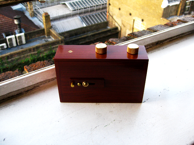
I have been experimenting recently with my pinhole camera.  It's a very simple device; it has no viewfinder, batteries, or play-back function, and uses medium-format film.


Because of the rudimentary nature of camera – and because the shutter must be manually opened for a number of seconds – the resulting images are blurry and atmospheric and warp in delightful ways.


This sort of photographic practice chimes with my project in a number of respects.  To start, because the shutter is open for so long, the images better capture the animation of things and spaces.  It captures movement – the unsteadiness of my hand, the flow of the city, and the vibrations of stationary things.


Equally as exciting to me, the camera itself feels like a thing as opposed to a technology.  In this, way, the camera remains a thing among things through the photographic process.


Because I don’t need to hold it to my face, the pin-hole camera doesn’t mediate my experience of the space.  My presence in the scene remains uninterrupted.  The camera, the other things in the shop, the shopkeeper, and I can all actively be in the space as its light and colour are captured on film.


The camera has become a welcomed talking point with shopkeepers.  Whereas the D-SLR can feel techy and conspicuous, the pin-hole is charming and unobtrusive. 


Although photography need not be about taking, street photography is often associated with masculinity, aggression, and a patriarchal way of seeing.   Certainly participation and openness can be felt in digital street photography as well.  Still, it feels like the pin-hole camera tends towards greater sharing, participation, and parity.


I am really taken by the softness of the images in contrast to the characteristic plasticity or shininess of the brands.  The pin-hole camera literally takes the edge off and references the tenderness of the curation. It seems to challenge the linearity and brandedness of the things in these places.  By capturing pattern and colour, the pin-hole melts these brands into the texture of the city.

01 March 2012

Border state

When I moved to London in autumn 2010, corner shops had bright blue adhesive borders around their windows to advertise the TFL Oyster top-ups available inside. Six months later or so, I noticed Lebara phone card branding had begun occupying this space. The vibrant azure blue is virtually the same in both brands.


Outside of my study area, but along an often travelled route, shop keepers on Edgware Road combine the Oyster and Lebara borders.  It is a very clever – and virtually seamless – merging of branded material. (Very exciting!)

 
In the last few months it seems Lebara has been upstaged by Lyca, another phone company, which has been increasingly occupying this edge space.  Their blue is more cobalt in hue. 


Recently Oyster stepped up and designed a flashier border, which uses the azure and cobalt blues on the Oyster logo card.  The cobalt matching the Lyca logo quite well.  


Like the shop on Edgware Road, the shops in Bloomsbury/King's Cross area show some amazing mash-ups of this material.  In the image below, Oyster, Lyca, and Lebara collide.

Wall's has also become part of the shop window borderlands.